

Unveiling the new Mercado Pago Monitoring Dashboard
In the world of digital payments, where every millisecond and every transaction counts, observability and metrics are not just a competitive advantage — they are the backbone of business success and stability. Observability is what helps you form hypotheses and draw data-driven conclusions.
Integrating a payment gateway requires trust. You need to know whether your application is performing as expected,whether webhooks are being delivered successfully, and most importantly, whether there are failures that require your immediate attention.
That’s why we created the Monitoring Dashboard. It is your data hub that compiles the most critical calls in your Mercado Pago integrations, giving you the power to measure, diagnose issues, and optimize performance with confidence.
🛠️ What’s inside the Dashboard?

No more unexplained ups and downs. Let’s dive into the data that will help you master integration optimization:
- API Requests: how many requests are being processed by the gateway within your selected time window.
- Errors: how many requests failed and which ones.
- Webhooks: how many notifications were sent and processed, and which ones failed.
These data points are displayed across 6 different visualizations to make your life easier, with filters by time window and data type.

To give you a sense of scale, we store an average of 330,000 records per day. Many are useful data for you; others are internal records. Our busiest endpoints reflect the heart of payment operations. What you see in your dashboard is the result of filtering performed directly on our processing queues, ensuring that only relevant data for your business is displayed.
In many cases, these records are automatically aggregated into insights. For example, if you received more than 15,000 requests in the last hour, the dashboard intelligence consolidates them for easier visualization. A single “data point” can represent more than 15,000 requests that occurred in the same hour with the same status and application. That’s true aggregation efficiency. Here’s what you’ll see:
1. API Requests chart
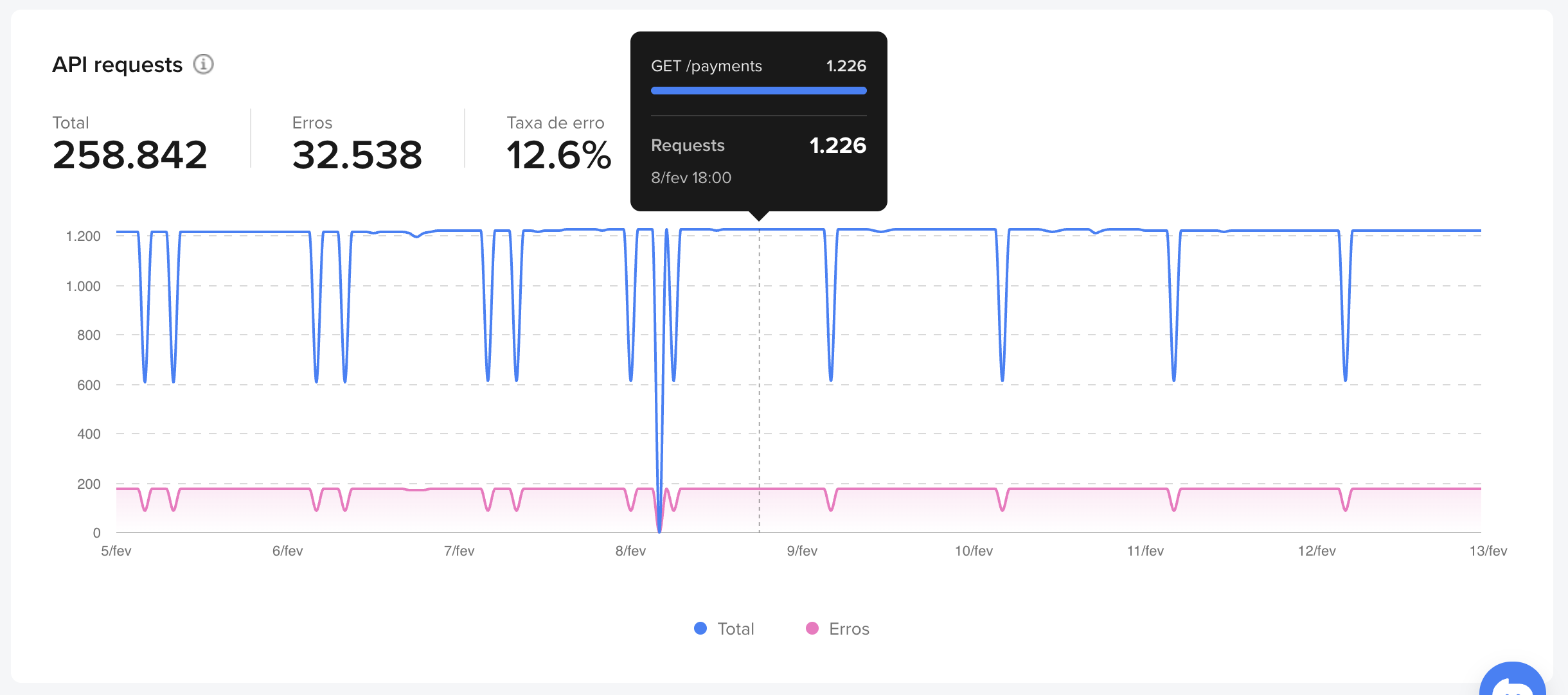
This is your thermometer. The chart displays the number of requests grouped by hour.
2. API Request Errors table: focus on weak points
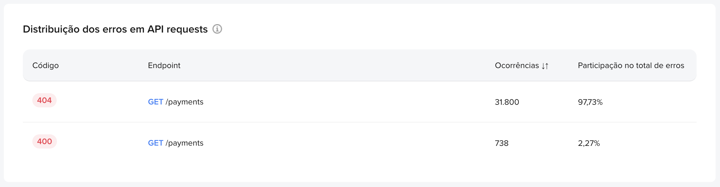
Right below, the errors table acts as your debugging tool. It focuses only on failed requests, grouping them by HTTP status and endpoint. Use it to quickly identify the weakest link in your integration.
3. Webhooks - Notifications and response time


If your application depends on webhooks, you know delivery and response time are critical. This chart connects directly with our API and provides these metrics in real time.
4. Integration Quality
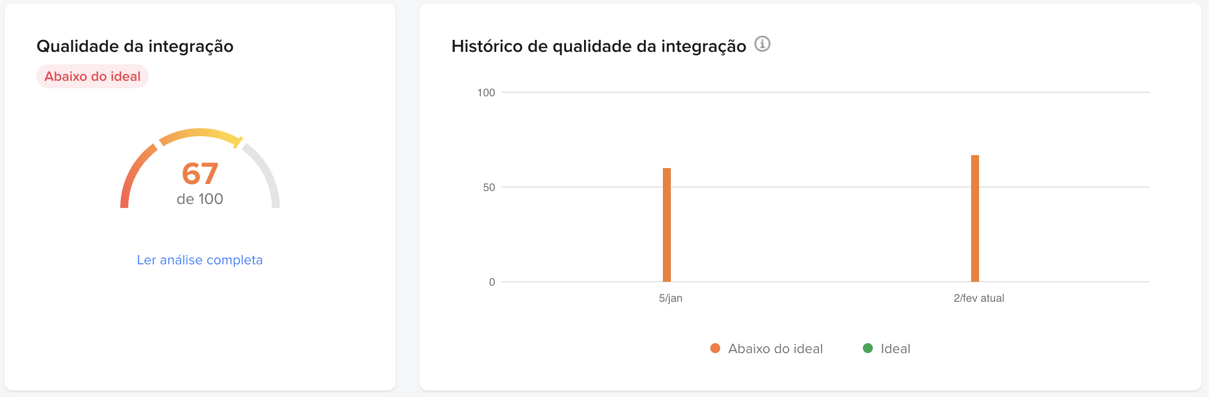
This is our “Overall Health” panel. It provides direct feedback on your certification (homologation) status.
The Monitoring Dashboard was built with you, the developer, in mind — giving you the data you need, intelligently organized and ready for action. To access it, go to Your integrations, select your application, and in the left-side menu, click Monitoring Dashboard. Happy optimizing!